Published 11th July 2023
The Best Websites in Web3 | 16 Examples of Web3 Website Design
The world of web3 brings a lot of exciting possibilities for web design. It’s time to think bold, fresh, innovative, and create a web experience users won’t forget. Whether you’re new to web3 or you’ve been here a while, we’re here to help.
As a web design agency specialising in web3, we’ve built a website or two. We know how important a website is for your web3 product. Your website is the first touch point for users and investors alike, and they should be greeted with a friendly face. Make sure your website instils trust in users, helping you to build a strong community of real people with faith in your product.
Web3 users are early adopters, forward thinkers and often tech specialists, which goes to say they are probably web-savvy. Designing a website in the web3 space presents unique challenges. While it can be easy to get carried away explaining just how cutting-edge the technology is, it is important to remember that what users really need to know is how it can be of value to them. The design should explain the benefits and ensure user-friendliness in its approach.
How does web design in web3 differ from traditional design?
Web3 design mirrors many web2 principles but often involves more complex technologies. This means that the user experience is still king, and each site should be tailored to its specific niche and audience. Given that not all internet users have even mastered web2, it’s crucial for web3 sites to be clear and user-friendly for all expertise levels. Balancing simplicity for novices and depth for experts is key.
In web3 design, there are already a handful of common trends, such as 3D elements, animation, narrative building and gamification. However, simply wedging any one of these ideas into your design does not guarantee success. It is essential to assess your target audience, your competition, and your unique selling point to figure out the best approach.
For example, if your project is based on a game or product journey with a compelling narrative, consider how the website can also tell that story. If you’re building your own metaverse, consider drilling down on 3D assets. To explain very complex technologies, you could use animation to break things down.
Most importantly, establishing trust is vital. As a web3 brand, there’s every chance that all of your touch points with the consumer are going to be digital. This makes building trust much harder, especially in an industry as new as web3. A trustworthy web3 project should reveal real identities on the website, perhaps linking to LinkedIn or other social profiles. This transparency fosters trust and genuine intentions.
In essence, good web3 design prioritises trust, community, and clarity. Websites should educate, engage, and empower users, creating captivating pages that encourage product usage.
We’ve broken down some of the best websites we could find from the 4 major areas of web3:
- Blockchain Development & Investment
- NFTs
- Decentralised Finance (DeFi)
- Gaming
Blockchain Development & Investment
Polimec
Polimec’s website takes a unique approach, condensing extensive technical project details into a single page, creating a flowing, video-like experience. Users navigate at their own pace through well-organised sections featuring graphics and animations. The top banner serves as bookmarks for seamless navigation.
The website skillfully integrates colours matching Polimec’s branding, maintaining a cohesive identity. While the abundance of technical jargon may challenge newcomers, the use of illustrations helps bridge the gap. They use storytelling to break down the Funding section, making it much clearer to someone unfamiliar with the usual process.
Given Polimec’s focus on community-driven funding for blockchain projects, the website caters primarily to developers and crypto investors.
Sede Blockchain
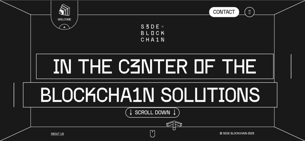
Hailing from Spain, this blockchain solutions company boasts a retro-futuristic aesthetic that seamlessly blends the boxy charm of 90s hardware with a contemporary twist.
Much like Polimec, their website employs a sleek scrolling feature, transforming navigation into a fluid journey rather than a compartmentalised browse.
Upon entering the Services section, the homepage experience opens up, revealing individual pages that burst with visual flair. Expect dynamic colour switches, animated transitions, and immersive 3D elements that elevate the user experience.
CMCC Global
This Asia-based investment firm uses the solidity of the cube in their design to signify their dependable nature as a strong investor in the web3 space. The shape is employed in 3D in the background of the homepage, as well as being used in two dimensions as a square as part of their logo, ensuring a synergy between the site design and their business identity.
The website has a high-end look, matching their tone and intended customer approach as a serious investor in blockchain technology. The website overall matches the sensibilities of web3, which is typically more fun and inviting, without sacrificing the sense of professionalism.
NFTs
Elynxir
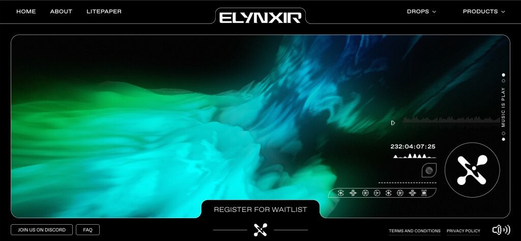
This NFT-based music service uses AI to generate music for its uses through its Korus bot. Their website is somewhat stripped-back but feels drenched with its cerebral cybernetic theme. The homepage showcases an impressive display fit for a space odyssey, with dazzling colours that flow like a luminescent river of sound, reminiscent of waveform.
The visualisation resembles a music equaliser, matching the aesthetic with the product perfectly. They utilise storytelling very well, showing text at different stages to command your attention, familiarising you with the brand. It’s quite the display, making up for the somewhat clunky interface that isn’t too easy to navigate for people unversed in web3 or their project.
Hape Prime
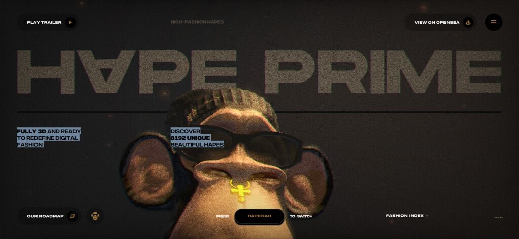
This NFT fashion site features an ape character, resembling one of the famous Bored Ape NFTs, strutting down the catwalk showing off a range of adaptable outfits. The focus here is fashion and the idea of a fashion show, which is what the project is all about.
The “Hapebar” along the bottom allows the user to switch the colour palette of the whole site, bringing a level of interaction that prompts the user to act, giving life to an otherwise simple site.
This sort of site is a great example of how to show off visual media like NFT fashion. It’s simple, but effective.
Chainzoku
Chainzoku is an NFT project that combines storytelling with customisable characters in an interactive near-future world. The website’s format is engaging, resembling a film or video-game opening that allows users to explore the narrative and project features. The design’s unique style and visuals reflect the project’s anime and video-game inspiration, with Zokus being the featured product.
The design is tailored to match the aesthetics of Chainzoku’s world and characters, although it may not work for all blockchain projects. The key takeaway is for web design to follow the product and not vice versa.
MetaHero
MetaHero’s site features a strong call-to-action and supporting imagery that perfectly illustrates their product to the prospect audience. The site allows users to scan their physical bodies to create a life-like digital NFT, meaning users can digitally embody themselves in gaming and retail applications.
The aesthetic of the site is a blend of modern tastes and some sci-fi elements, supporting their claim that the metaverse is not the future, but the present.
They use a variety of colours to visualise their three main areas of use for their product: healthcare, gaming and fashion. They have smartly left themselves room in the design to add more use cases in the future.
BlockBook (formerly The Quest of Evolution)
BlockBook’s site is a perfect example of matching the visuals with the product. The website employs a fantastical aesthetic, and makes use of storytelling to elevate the feel of the site to dramatic proportions, perfectly coupling the site with the product itself: an NFT platform for storytellers.
BlockBook is undeniably appealing to look at with such a strong style, but with such artistic design it can be easy to lose some usability. The ever-present menu button helps to counter any confusion that the user may experience.
DeFi
Mozaic Finance
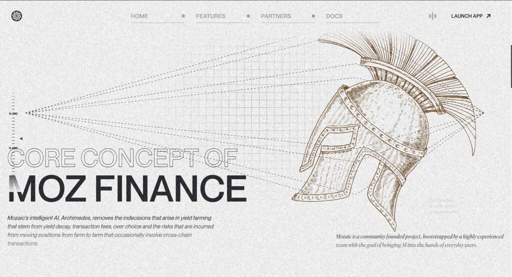
Mozaic Finance’s website embraces an Ancient Greek aesthetic, reflecting its commitment to the ‘omnichain future’ and the ‘AI Archimedes’ product for multi-chain yield farming. The design permeates the entire site, creating an authentic feel with background illustrations and a grainy visual effect.
The Ancient Greek theme aligns with Mozaic’s emphasis on intelligence and sophistication in its AI-powered services. Once the app is launched, the stylised aesthetic transitions to a more utilitarian design for focused financial decision-making.
Mozaic Finance is a great demonstration of when bucking the trend can actually work in your favour. In more ‘traditional’ DeFi, it is common to find a design that is very gradient-heavy, with a focus on the ‘future of finance’ angle. Going against norms here makes the project look like a serious, fresh take.
ChainGPT
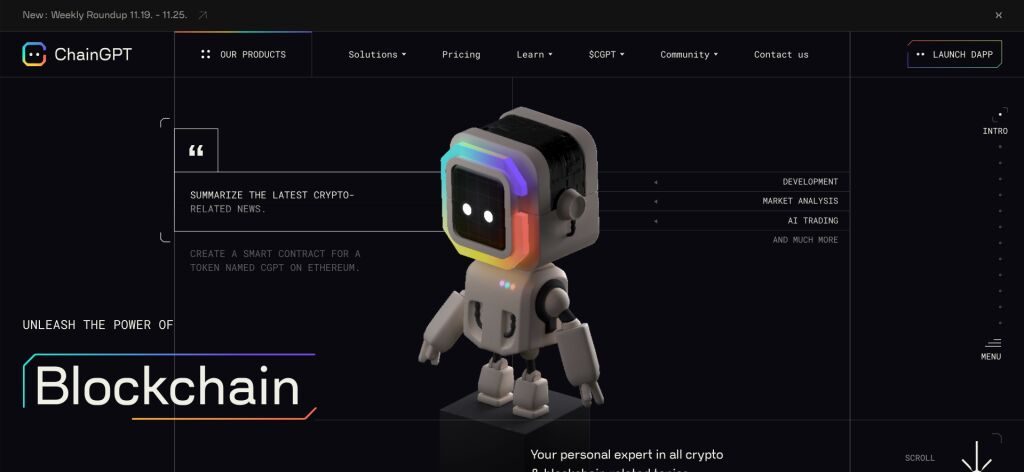
The ChainGPT website boasts a non-traditional design that is still easy to navigate. Emphasising clarity and brevity, the site uses clean lines and strategic use of whitespace, complemented by 3D elements that make the colour pop out the screen.
The presence of the ChainGPT robot mascot adds a distinctive identity throughout the site, accompanying visitors on their journey. The mascot adapts to the user’s position on the site, making the site feel more responsive.
Overall, the ChainGPT website effectively conveys the company’s value proposition to the target audience. Thoughtful and well-crafted, the site is poised to leave a positive impression on visitors.
Dstafin
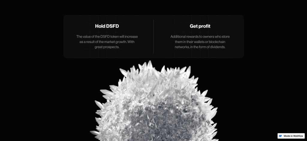
Dstafin’s website strikes a perfect balance between simplicity and functionality. Navigating the site is a breeze, thanks to its clean layout and clever use of whitespace, creating a calming effect. The chosen typography enhances readability, contributing to an overall positive impression of the Dstafin brand.
Dstafin’s site uses animation to make the DSFD coin come with you on the user journey, signifying its importance as the heart of their ecosystem.
Notably, the responsive design ensures a fantastic user experience across all devices, making Dstafin’s website both visually appealing and highly accessible.
Superfluid
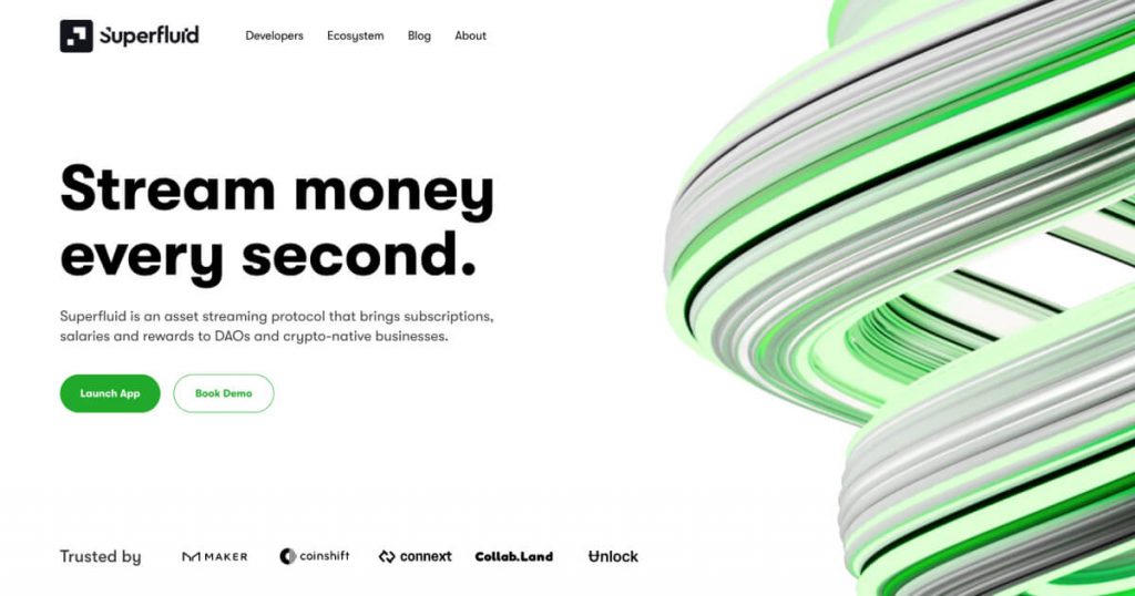
Superfluid is an example of the form matching the function. The function is to provide a financial solution service that turns ingoings and outgoings into steady streams of capital that can be controlled in real-time. Naturally, this service requires absolute trust, and this is reflected by the self-serious tone of the website.
Unlike the previous NFT sites, gamification and punchy graphics are unnecessary here, and could possibly even harm adoption of the product. The website is clear, concise and easy to navigate. It also contains a wealth of information about the team and the roadmap
The graphics create a visual and tangible interpretation of an intangible concept, using photorealistic graphics to ground the user’s understanding and build transparency. We especially love the fact that the wires pictured below evoke the same visual identity found in the logo of the site.
Gaming
Portal
Portal are a big name in the web3 gaming space, and their website does a fantastic job of reflecting that.
The site seamlessly blends gamification with a keen emphasis on motion and fluidity. This helps the site go beyond simply presenting information; it immerses the user in an experience reminiscent of entering a cutting-edge gaming environment rather than a conventional website.
The incorporation of smooth scrolling mechanics entices users to explore the digital landscape in front of them. This deliberate design choice not only enhances user engagement but also creates an immersive journey through the website. Navigating through the web page becomes a pleasurable experience, encouraging users to learn more about the Portal project.
Overall, the website serves as an entrance into the innovative world of Portal, mirroring the excitement and innovation associated with the industry giants they have collaborated with. The addictive yet pleasant nature of the browsing experience becomes a reflection of the calibre and creativity associated with the Portal brand.
BITKRAFT
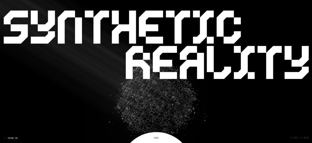
Bitkraft, a blockchain-focused venture capital firm in gaming and esports, presents a futuristic vision on its website, embracing the concept of “synthetic reality” where digital existence is as real as the physical.
The site combines bold cyberpunk aesthetics with a user-friendly design, featuring contrasting black and white elements to emphasise core information. The hero section stands out with a captivating background image, clear headlines, and a prominent call-to-action.
The portfolio showcases successful investments with logos and brief descriptions, providing insights into Bitkraft’s expertise. The leadership team section includes headshots and bios, offering visitors a glimpse into the people driving the company’s vision.
GamiFi
The focus with GamiFi’s site is clearly on finding the fun in web3, achieved with animated 3D graphics and vibrant colours. The site’s intuitive navigation, clear menu options, and responsive design ensure a seamless journey across devices.
Strategically placed and visually distinct CTAs guide users to essential actions, fostering engagement by providing clear instructions for signing up, joining communities, or exploring features. The site mirrors the intention of the project and incorporates gamification elements so that the concept is clear to the user.
The inclusion of 3D graphics enhances the site’s appeal, offering an enjoyable visualisation of the product concept. By spotlighting gaming before blockchain, GamiFi targets a broader audience, gradually introducing users to the web3 mindset through core elements like gaming, shopping, or music.
Star Atlas
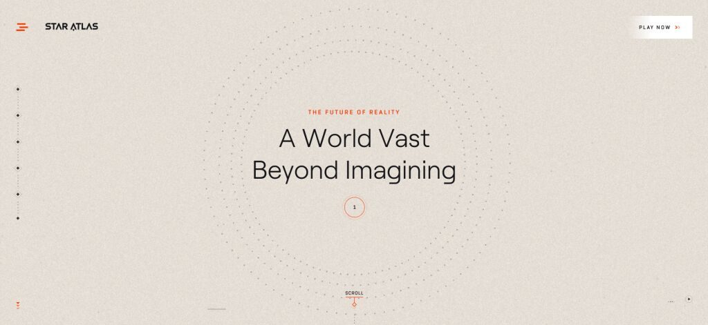
The scope of Star Atlas practically demanded an equally grand website, and so their web design team delivered. The sprawling website is somewhere between a tutorial and a cinematic opening, as you traverse its vast universe with your scroll wheel.
The site walks you through the various aspects of the app, familiarising users with the concepts before releasing them into the interface itself. The scrolling site is reminiscent of the rolling wall of text from popular sci-fi, introducing the audience to the essential context before they begin their quest.
The creme palette used for the background may seem at odds with the space theme, but works perfectly with the high-tech dot images that resemble futuristic holograms. The page is bright and inviting to the eye, with strong contrast between the foreground and the background in every section.
Summary
As a web design agency specialising in web3, we pay a lot of attention to what’s going on the space, and we’re not afraid to give credit where it’s due. The websites above all support the idea that web design principles stay the same whether you’re designing for web2 or web3. No matter the industry, anyone can put off a great idea if the presentation is poor.
The secret to great presentation is having a solid idea on the intention of your product. Is it to attract a new audience or convert an existing one? Is it intended for web3 natives, or web2 newcomers? Is it a game, a metaverse, or a DeFi platform? Make sure your presentation is appropriate for whatever your project is, in both the product and the website.
Web design can be difficult and time-consuming, especially for new starters and smaller projects. Very often it is better to consult a specialist to make sure your project gets the best presentation it can. If you’re looking for guidance or consultation of any kind, consider reaching out to Avark for expert help.
